Overview
Brand losing foothold.....
The Mirror is a massive brand with more than 400 stores in 32 countries across the globe. They are a clothing chain for adults and kids. They carry a wide range of clothing styles: casual, business, sporty, party, and formal. Their main idea is to bring affordable clothing to everyone. Their main concern is falling being their competitors as the brand does not have an online store.
The Challenge
The current website is outdated and only has information about the company and its locations.
There is no e-commerce responsive website for the user's shopping convenience.
Currently, there is no mobile app for the brand.
There is no e-commerce responsive website for the user's shopping convenience.
Currently, there is no mobile app for the brand.
The Opportunity
Rebrand
Revamp the brand image by creating a new company logo that is modern and neutral to attract all types of customers.
Responsive Website and Mobile App
A new modern and minimalistic responsive e-commerce website will entice existing users and new users.
01. Empathy
Identify the user's pain points and frustrations while shopping online. Gain insight into how the users like to shop.
Research Overview
• Understand where, when, and how people do online shopping.
• How often do they shop online?
• What devices do they prefer to shop on?
• Find out pain points while shopping online.
• Understand what features customers prefer on the website to make their search easy.
• Analyze the competitor's website and determine what they are doing right and what they are not.
Competitive Analysis
I conducted a competitive analysis to determine the strengths and weaknesses of the direct and indirect potential brand competitors. I noted their similarities and differences, which helped define what makes Mirror unique and what should be avoided design-wise. This analysis helped me to anticipate the general features that would be absent and present on shopping websites that my participants in my user interview shopped at.
Takeaways
1. Good customer service is of great importance to the customer.
2. Company strategies- Fast delivery, Free delivery, easy-to-navigate websites, and other perks such as free returns entice users to return to their online stores.
3. The use of social media helps the brand to gain name and revenue.
4. Low cost/ discount and fast fashion are more popular currently across a broader age range.
5. Good User experience can increase the number of loyal customers for the online stores.
6. Consumers like in-trend clothes. The brand needs to stay up with the current style.
Understanding the customer — 1-1 Interview
I conducted 1-1 interview in person. I was able to understand what are the needs and pain points of the users. Their direct feedback gave me insight and information I had not considered. I realized that different users have different approaches to completing the task.
Sample Questions — I tried to keep the questions open-ended so the users could tell their stories.
Tell me, do you like shopping?
How do you usually shop?
Tell me, when was the last time you bought clothes online?
Can you share your experience with online shopping
Can you tell me: how often do you shop online?
Last time you returned the clothing item?
How do you usually shop?
Tell me, when was the last time you bought clothes online?
Can you share your experience with online shopping
Can you tell me: how often do you shop online?
Last time you returned the clothing item?
Key Findings
Story Board
A quick storyboard was created for persona — Amy Lee to understand users’ behavior and reactions to externalize the knowledge about the user.
Storyline- Amy (persona) orders a dress online. When the dress arrives, she finds out that the dress size is running small, which disappoints her a lot.
Storyline- Amy (persona) orders a dress online. When the dress arrives, she finds out that the dress size is running small, which disappoints her a lot.
Empathy Map
Takeaways
1. Attractive, functional, simple, and intuitive website.
2. It should be a responsive design as most of the users use mobile.
3. The brand's presence on social media.
4. Shopping is an activity to relax.
5. Deals, Sale, and clearance is the first exploring section for some users.
6. Design should follow the visual hierarchy.
2. It should be a responsive design as most of the users use mobile.
3. The brand's presence on social media.
4. Shopping is an activity to relax.
5. Deals, Sale, and clearance is the first exploring section for some users.
6. Design should follow the visual hierarchy.
02. Define
Persona
Firstly, I gathered the research information and developed two personas to understand users’ needs, experiences, behaviors, and goals.
Meet Amy Lee, A fashion enthusiast.
Amy finds online shopping a relaxing activity. She likes to follow influencers and is always looking for new trends. She seems to shop the whole look. This persona was created based on the patterns uncovered in the users' interviews and empathy mapping.
Amy finds online shopping a relaxing activity. She likes to follow influencers and is always looking for new trends. She seems to shop the whole look. This persona was created based on the patterns uncovered in the users' interviews and empathy mapping.
Meet Oliver Kramp — Bargain Hunter
Oliver shops only when he finds a deal. He usually shops from the sale or clearance section. This persona was created based on the patterns uncovered in the users' interviews and empathy mapping.
Oliver shops only when he finds a deal. He usually shops from the sale or clearance section. This persona was created based on the patterns uncovered in the users' interviews and empathy mapping.
Journey Map
The data was translated into a visual journey of the two personas.
Venn Diagram
I listed the Mirror brand's overall business goals, users' goals, and technical considerations. Then I created a Venn Diagram to find the overlapping similarities mainly. The list obtained from the overlapping helped me prioritize and define the goals for the business.
Roadmap
Based on the users' research and project goals, I created the features' roadmap to identify and prioritize the features that can be solutions to Mirror's users' goals, frustrations, and needs.
Based on the users' research and project goals, I created the features' roadmap to identify and prioritize the features that can be solutions to Mirror's users' goals, frustrations, and needs.
Card sort
The objective was to conduct an open card sorting exercise to discover and understand how users would like to categorize similar yet different items found on the e-commerce site. Also, know from the findings how to organize the content. I used the Optimal workshop to conduct an open card sorting. The 9 participants put 30 clothing items into categories. I was an invaluable source of insight into how people order sorts. The card sorting helped me create a sitemap, task flow, and user flow.
Takeaways
• Most of the participants categorized the items based on which body parts the clothing item is worn. (Ex: Tops, Bottoms, etc.)
• Some items belong to more than one category.
• Decide whether to stick to the current category names or rename them so that the users can quickly locate the items
• Decide where to have categories like loungewear, party wear, etc., or by the clothing type.
• Some items belong to more than one category.
• Decide whether to stick to the current category names or rename them so that the users can quickly locate the items
• Decide where to have categories like loungewear, party wear, etc., or by the clothing type.
Site Map
I used the findings from card sorting to create the sitemap that matches the users' mental models, allowing the users to find the items quickly.
Task Flow and User Flow
I created a task flow and user flow to show the persona's (Amy Lee) potential steps when she arrives at the Mirror site. I created a happy path where Amy could finish her task in minimum clicks. Amy's task is to buy a black maxi dress. Generating these flows helped me understand which pages I need to build in low-fidelity wireframes.
I created a task flow and user flow to show the persona's (Amy Lee) potential steps when she arrives at the Mirror site. I created a happy path where Amy could finish her task in minimum clicks. Amy's task is to buy a black maxi dress. Generating these flows helped me understand which pages I need to build in low-fidelity wireframes.
03. Ideate
Wireframes
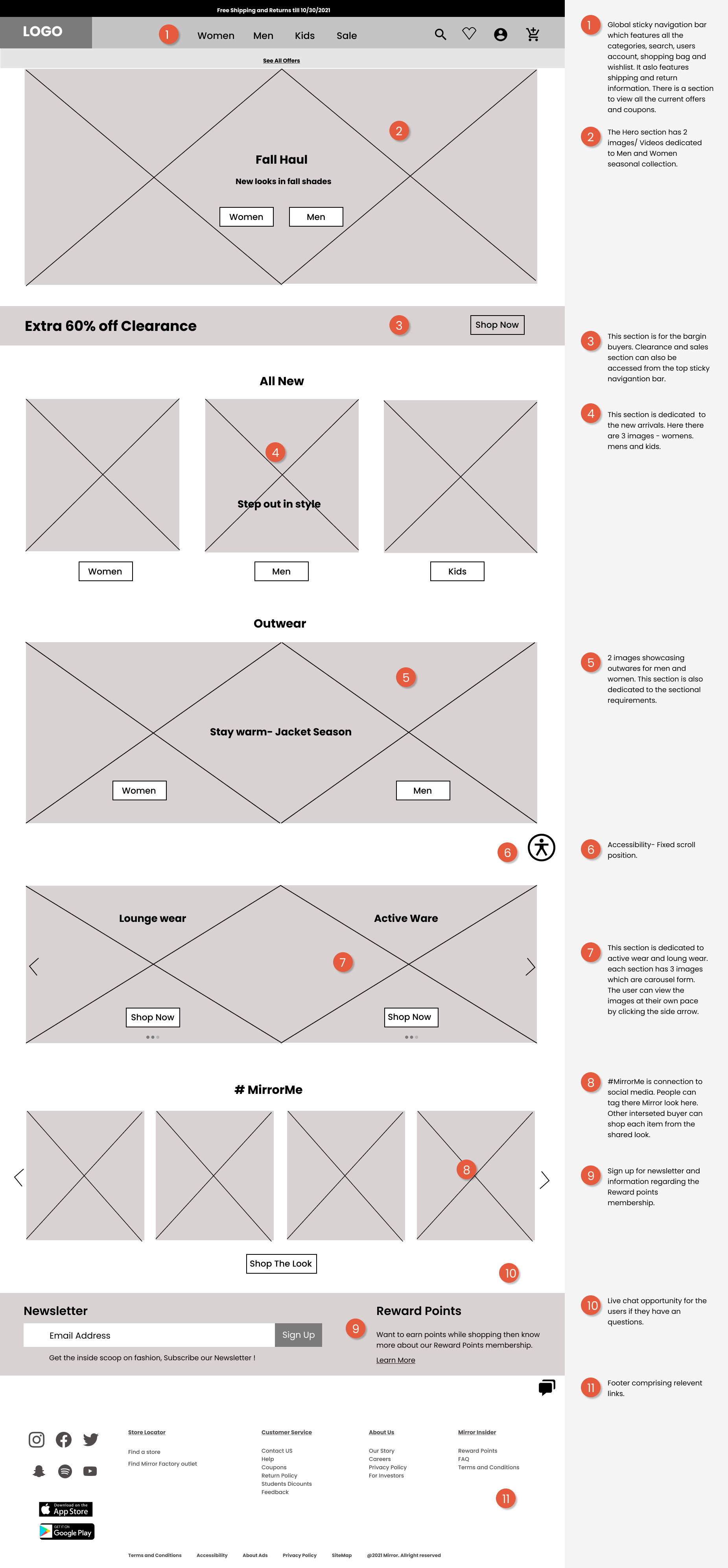
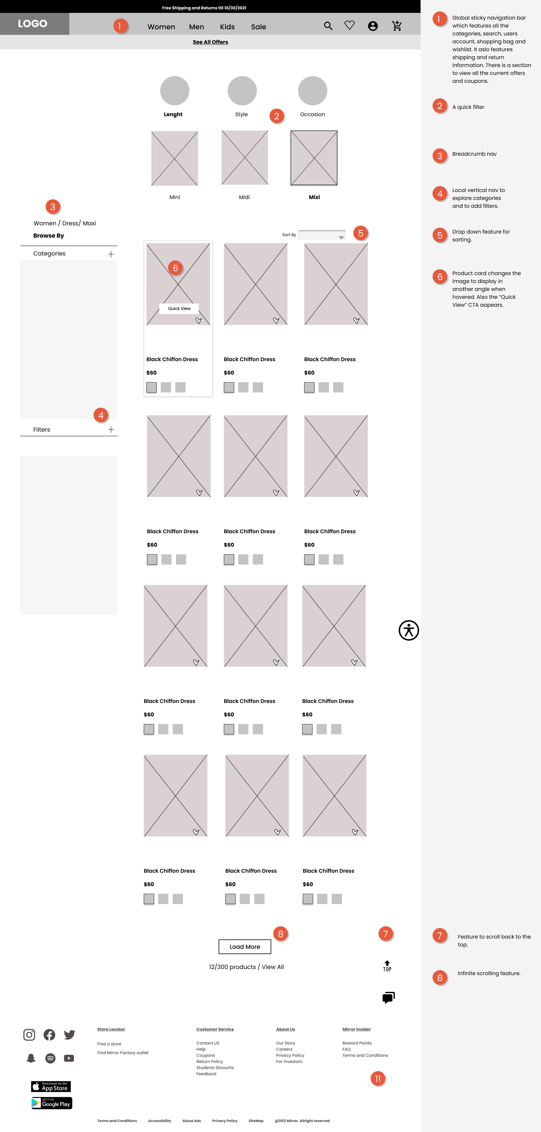
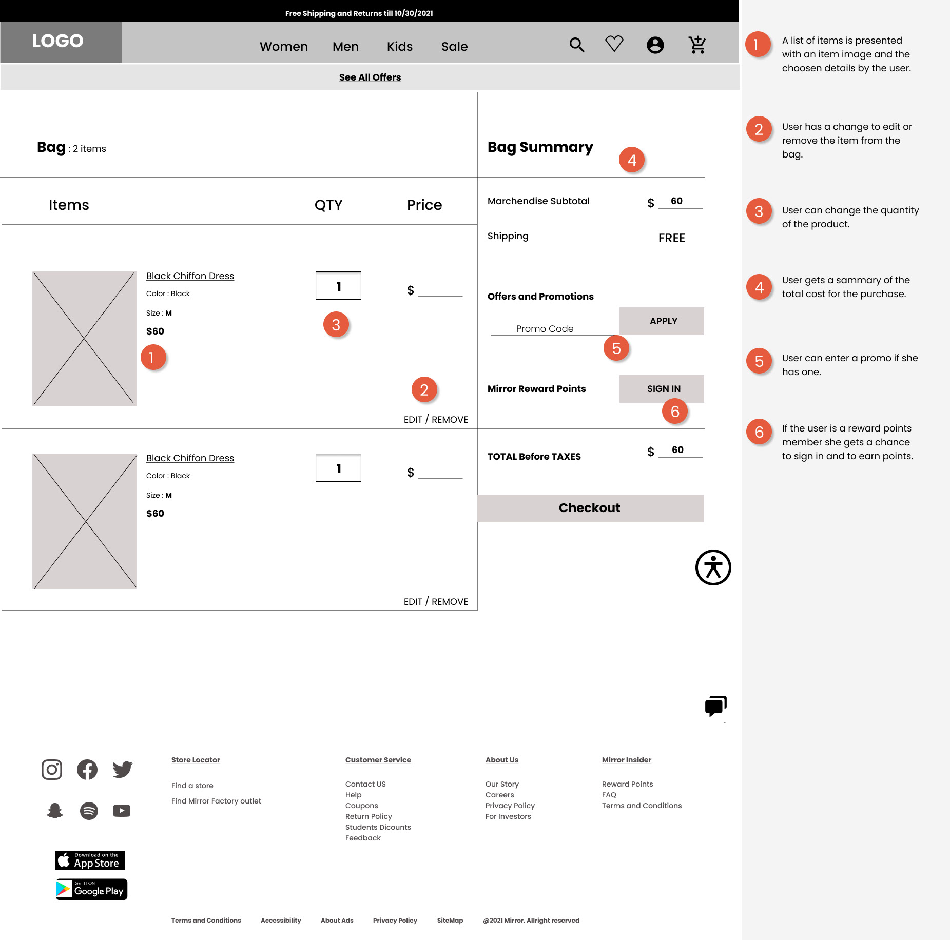
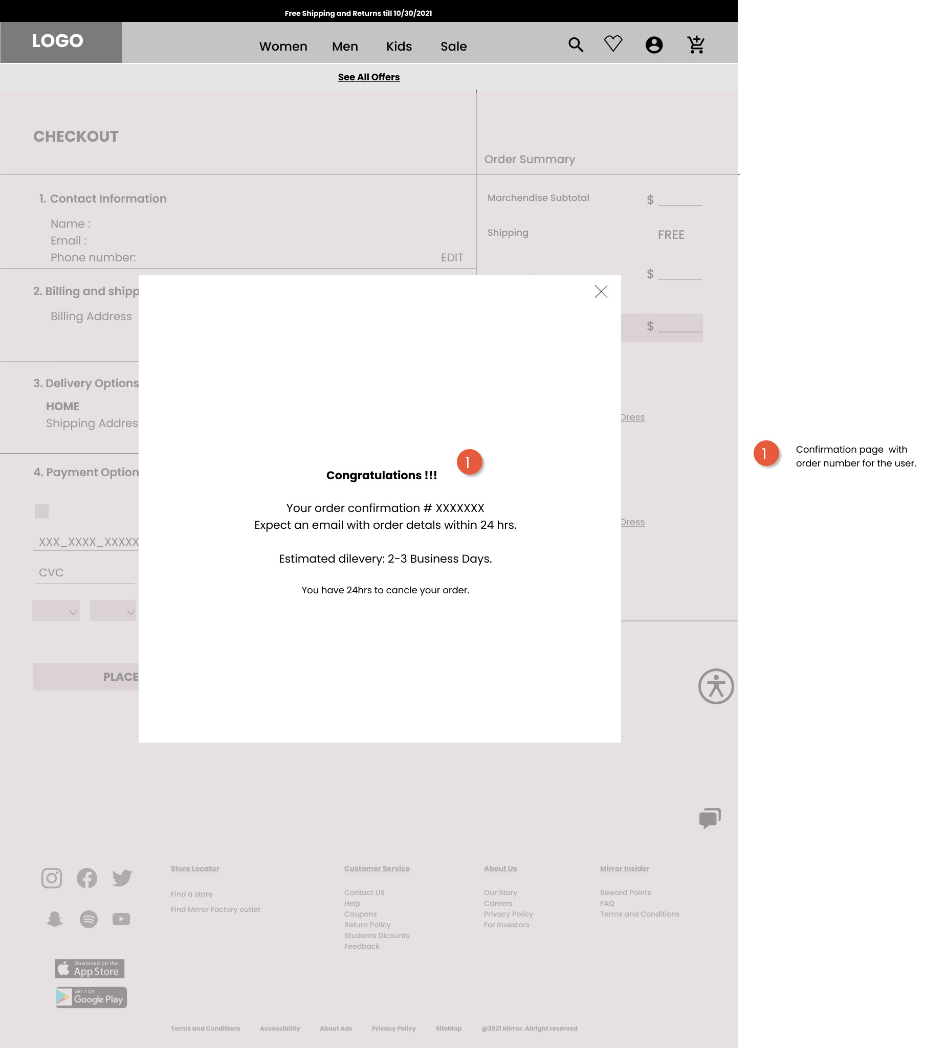
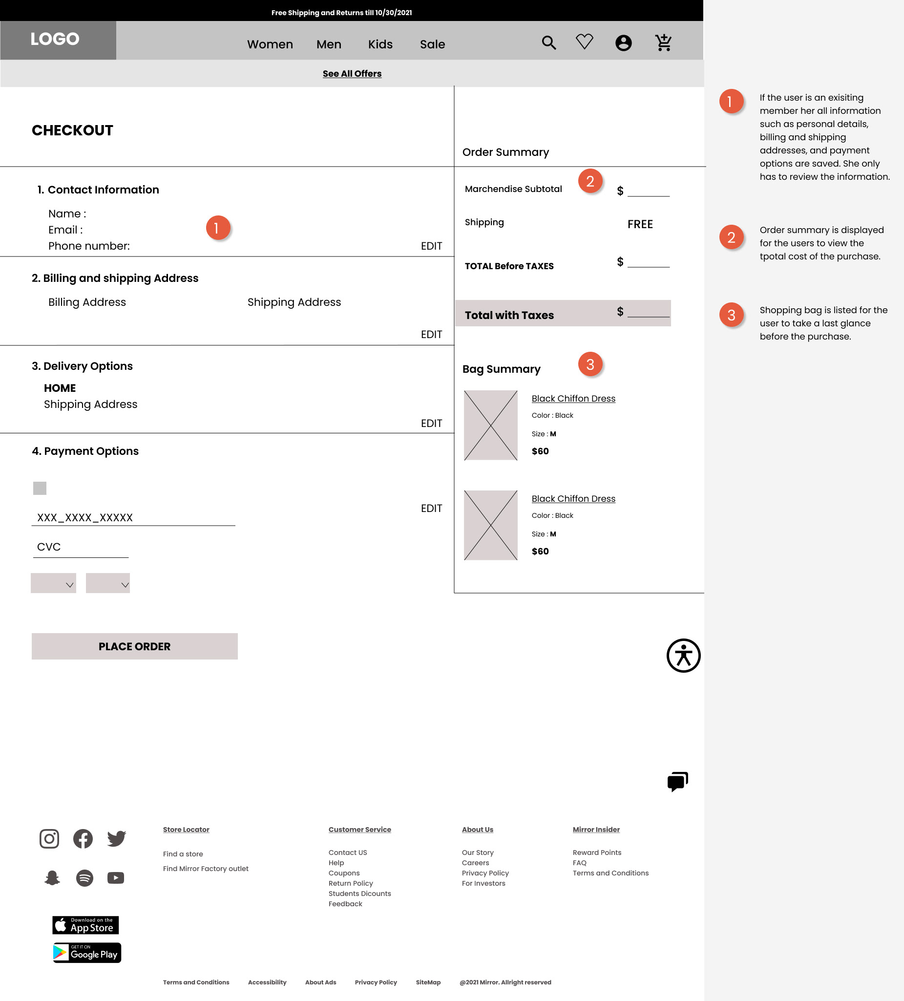
To create wireframes, I referred to the users' research to address the users' pain points, needs, and motivations. Initially, I hand-sketched out several different layouts for the home page. Once I finalized the elements and direction of the homepage, I digitized the sketch.
Key design considerations
1. It was important that I kept the UX best practices for online retail shopping to promote a user-friendly and intuitive site.
2. Clear and Easy Navigation.
3. From the users' interviews, I found that the deals were essential on the homepage because users mentioned that they only shop when they get sales.
3. I made the clearance section prominent on the home page. In addition to that, I also added a sign-up promotion newsletter to engage and motivate users to shop online.
4. I also incorporated social media presence by showcasing trending influencers as the users want to buy clothes that the influencers wear.
5. The feel of the website will be calm and relaxing as many users browse the website to relax; hence the color palette helps a prominent role.
Responsive Landing Page
Desktop wireframes
Landing Page
Categories page

Product Page
Shopping Bag
confirmation
payment
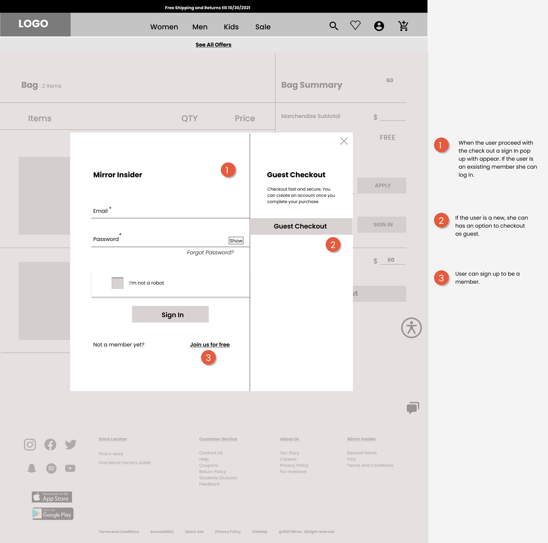
create account
Mobile wireframes
Design Process from sketch to Hi-Fidelity wireframes
UI: Logo and Style Tile
The color palette is in cohesion with the research data. Since the Mirror brand caters to a wide range of age groups, I decided to use a warm neutral tone that provides a sense of reliability and confidence. Overall, I wanted to set a relaxing, inviting tone that made the users welcome.
To re-brand Mirror, I crafted the different adjectives that described the brand value. I sketched out some options representing the brand's core value. I created a new simple, modern, and, most importantly, memorable logo.
04. Prototyping
From the wireframes and UI kit, I created high-fidelity wireframes for prototyping. I created a journey for the users to search and purchase a black maxi dress.
Task: It's your friend's birthday, and all the friends have decided to take the birthday girl out for dinner. For this occasion, you envision a black maxi dress for the event. You immediately take your mobile device and access the Mirror App. The Mirror is you go to App to buy clothes.
05. Testing
Test Objective
• Test the overall usability and the ease of navigation throughout the application.
• Test if the users can finish the task and the effort and time taken to complete the job.
• Test if it is easy to locate all the necessary information required to make decisions to complete the task.
• Identify if any areas of the App cause confusion or difficulty to the users.
• Test if the users can finish the task and the effort and time taken to complete the job.
• Test if it is easy to locate all the necessary information required to make decisions to complete the task.
• Identify if any areas of the App cause confusion or difficulty to the users.
Scenario: It's your friend's birthday, and all the friends have decided to take the birthday girl out for dinner. For this occasion, you envision a black maxi dress for the event. You immediately take your mobile device and access the Mirror App. The Mirror is you go to App to buy clothes.
Affinity Map
An Affinity map was created to find patterns and statistics for areas for improvement.
Findings
• Consistent
• Easy to navigate
• Aesthetically appealing
• Some unfinished design
• Consistent
• Easy to navigate
• Aesthetically appealing
• Some unfinished design
Prioritization Matrix
I created a prioritization matrix to identify and prioritize which iterations will be made first, depending upon importance and urgency.
Priority Revisions
Reflection
Mirror clothing brand was my first UX design project, and it was a great learning experience. I was involved in every step of the design process from start to finish. Going into this project, I thought I had a good understanding of e-commerce and online shopping; however, I realized I had many assumptions in the process. I learned the value of research and user feedback. It was interesting to learn and see how the shoppers behave differently towards the same task.
The most significant learning for me was to focus on the Users' needs. I need to align the designs with the users' thinking and solve the problem based on their frustrations and motivations. One thing is for sure I enjoyed doing the research and then finding a solution to align the results.
The most significant learning for me was to focus on the Users' needs. I need to align the designs with the users' thinking and solve the problem based on their frustrations and motivations. One thing is for sure I enjoyed doing the research and then finding a solution to align the results.

